From audio equipment to a framed object for modern living.
 Most audio products begin with the same questions.
How should it sound?
What components should it use?
How many inputs should it support?
How compact can it be?
How much power does it need?
These questions matter. A music device must work reliably before it can mean anything emotionally. But when we began designing M1, we wanted to start from a different question:
Where will this object live?
That question changed the direction of the product.
A music device is not used in empty space. It lives on a shelf, beside a sofa, near a window, on a desk, beside books, records, lamps, speakers, plants, and personal objects. It is seen in the morning, touched at night, moved between rooms, and noticed even when it is not playing.
In a modern home, audio equipment is no longer only a component in a system. It is part of the visual rhythm of daily life.
So we did not want M1 to feel like a machine that happened to be placed indoors. We wanted it to feel like an object designed for the room from the beginning.
That was the real design challenge.
Designing from the Room, Not from the Rack
Traditional hi-fi products were often designed around racks, cabinets, and stacked components. Their proportions followed a certain system: horizontal boxes, front panels, input/output logic, heavy enclosures, and a restrained visual seriousness. That language still works for dedicated audio setups, but it does not always work for contemporary living spaces.
Modern homes are more open, more mixed, and more visually curated. A single object may need to live on a desk in the morning, a shelf in the afternoon, and a side table at night. It must look calm from a distance, but still reward a closer look. It must feel designed without becoming visually loud.
For M1, this meant reducing the feeling of equipment and increasing the feeling of placement.
We did not ask only how to package a CD mechanism. We asked how the object could sit beside books, records, speakers, and furniture without disturbing the room. We asked how a product with visible engineering could still feel quiet. We asked how a music device could become part of the interior rather than a machine added after the room was finished.
This is where product design and spatial design meet.
A device built only for performance often asks the room to accommodate it. A device designed for living should adapt to the room.

The Shelf Test
One of the simplest tests for a home audio product is the shelf test.
Can it sit naturally beside the things people already own?
A shelf is not a showroom. It is personal. It holds books, records, small objects, souvenirs, speakers, lamps, and sometimes things that do not match perfectly but still feel meaningful. For a music device to belong there, it must have the right scale, the right visual weight, and the right level of presence.
M1 was designed to pass that test.
The framed shape gives it a familiar domestic language. People already understand framed photographs, framed prints, and framed artwork. A frame suggests that something has been selected and given a place. By using that language, M1 becomes less intimidating than conventional audio equipment.
It does not demand a dedicated hi-fi rack.
It can simply enter the shelf.
The visible structure also helps. Because the back panel is acrylic and the internal parts are arranged as layers, the product does not feel like a solid block. It has depth, air, and visual transparency. This makes it easier to place beside books or speakers without making the shelf feel heavy.
A music device should not dominate every surface it touches.
Sometimes, the best design is the one that knows how to sit quietly.
The Desk: Music Inside the Daily Workflow
Modern listening does not always happen in a listening room.
Sometimes it happens while writing emails. Sometimes it happens beside a laptop. Sometimes it happens during a late-night work session, a quiet morning, or a small break between tasks.
That reality shaped how we thought about M1.
A traditional audio component often feels too formal for a desk. It asks for cables, space, and a system around it. M1 was designed to be more flexible. According to the M1 user manual, it supports CD, CD-R, and CD-RW playback, MP3 and WMA formats, Bluetooth connection, 3.5mm wired output, remote control operation, and a removable 18650 lithium battery. These functions allow it to work with modern speakers and different placement needs without forcing the user into a traditional hi-fi setup.
But the important point is not the feature list. The important point is what those features allow in the home.
Bluetooth means the product can connect to speakers without needing a stack of components. The 3.5mm output keeps direct wired listening available. The remote control lets the device stay placed instead of being constantly handled. The battery gives it more freedom to move between rooms or surfaces.
Function, in this case, supports placement.

On a desk, M1 is not trying to become the main workstation object. It should not compete with the computer, lamp, or tools. It should sit with them.
That is why visual calm matters.
If a product is too aggressive, it interrupts the workflow. If it is too anonymous, it disappears completely. M1 sits between those two extremes: visible enough to remind you that music is present, quiet enough to let the day continue.
This is what it means for a music device to belong in daily life.
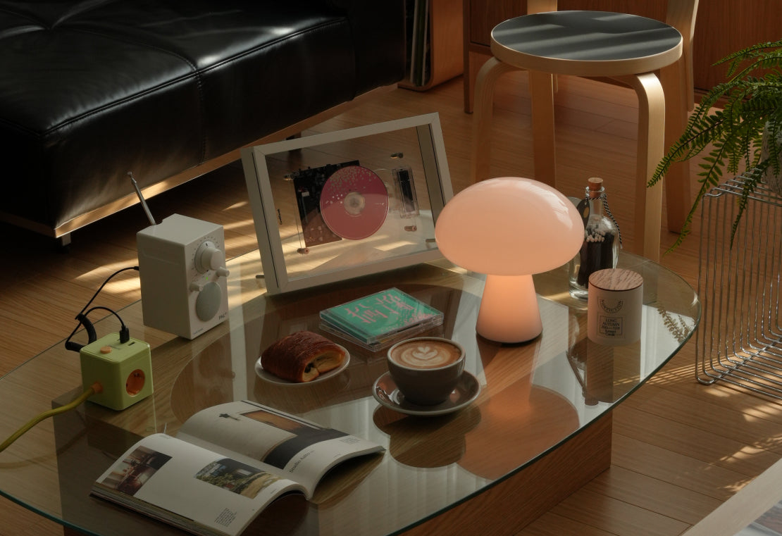
The Bedroom: A Softer Kind of Listening
Not every listening moment needs to be social, loud, or technically focused.
Some listening is private.
The bedroom is where audio design becomes more intimate. The product must feel calm, not assertive. It must work near soft textiles, warm lamps, books, curtains, and lower light. It must feel like a companion, not equipment waiting to perform.
This is where the white frame becomes especially meaningful.
The white frame reduces visual weight. It softens the presence of the device and allows the internal structure to feel lighter. In pale rooms, bedrooms, or spaces with softer materials, the white frame helps M1 blend into the atmosphere without becoming invisible.
It gives the product a quieter voice.

This matters because emotional products do not behave the same way in every room.
In a living room, a device may become a visual anchor. On a desk, it may become part of a workflow. In a bedroom, it should slow down. It should become softer, quieter, and more personal.
A product that belongs in the room must understand these differences.
Light, Reflection, and the Window Side
Acrylic was not chosen only because it looks modern.
It was chosen because it reacts to space.
In a room, materials are never static. Wood warms the light. Metal sharpens it. Fabric softens it. Glass reflects it. Acrylic does something interesting between glass and plastic: it catches light, creates depth, and makes a structure feel lighter than its actual volume.
This is especially clear near a window.
When M1 sits beside natural light, the acrylic back panel does not block the space like an opaque panel would. It allows light to pass, reflect, and soften the internal structure. On a glass table, the product gains another layer through reflection. The result is not a heavy machine sitting on a surface, but a lighter object interacting with the room.
This is one reason M1 works well in interiors with glass, metal, pale wood, soft curtains, and neutral walls.
It does not fight the room’s materials.
It joins them.

This is where spatial design becomes more than styling.
The goal is not simply to place M1 in a beautiful room. The goal is to make the product respond to the room: to light, surfaces, surrounding objects, and the distance from which it is viewed.
A product belongs when it participates in the atmosphere.
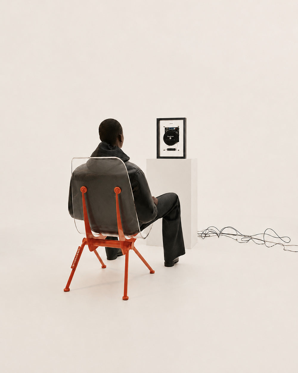
Black Frame as a Visual Anchor
If the white frame is about calm, the black frame is about focus.
Some rooms need a softer object. Others need a clear visual point. In a space with metal shelving, dark speakers, monochrome books, records, or stronger contrast, the black-frame version of M1 creates a sharper presence.
It works almost like punctuation.
The black frame gives the product definition. It creates a boundary between the transparent internal structure and the surrounding environment. In a bright room, this contrast can be useful. It allows the object to be seen clearly without becoming physically bulky.
The black frame also gives M1 a more gallery-like quality. It feels less like an appliance and more like a displayed piece.

The important point is not that black is more premium or white is more minimal. The point is that each frame behaves differently in space.
Black creates focus.
White creates calm.
Both allow the same object to enter different homes without losing its identity.
When the Product Is Not the Main Character
A product can look impressive in a close-up and still fail in real life.
The real test is whether it can live in the background without losing meaning.
This is especially important for home audio. Most of the time, the product is not being actively operated. It is simply there. It sits on a surface while someone reads, works, cooks, talks, or rests. A well-designed music device should not require constant attention to feel worthwhile.
M1 was designed for that quieter role.
It can be noticed without demanding to be noticed. It can become part of a corner, a shelf, a desk, or a room without turning every scene into a product display. This is why proportion, frame color, material lightness, and visual order matter.
The best home objects do not always shout.
They remain.

This is the difference between a product shot and a living object.
A product shot says: look at this.
A living object says: this belongs here.
For M1, that distinction shaped the entire design.
Designed for the New Listening Space
The modern listening space is not always a dedicated room with perfect speaker placement. Sometimes it is a bedroom shelf. Sometimes it is a desk beside a laptop. Sometimes it is a small apartment corner, a glass side table, or a quiet spot near a window.
That does not make the listening experience less meaningful. It simply means audio design must become more sensitive to real life.
M1 was designed for that reality.
It is not trying to replace every traditional hi-fi component. It is not trying to imitate an old CD player. It is not trying to become invisible. It is trying to create a new relationship between music, object, and room.
Useful, but not merely utilitarian.
Technical, but not cold.
Visible, but not loud.
Decorative, but still functional.
Modern, but still connected to physical music.
That is what it means for a music device to belong in the room.
It means the product has considered the space around it. It means the materials respond to light. It means the frame gives the object a place. It means the functions support daily life instead of interrupting it. It also means the device still feels intentional when it is not playing.
M1 was designed from that belief.
Not as a CD player that happens to sit in a room, but as a music object made for the room from the beginning.


Share:
Why Music Devices Should Not Be Just Black Boxes